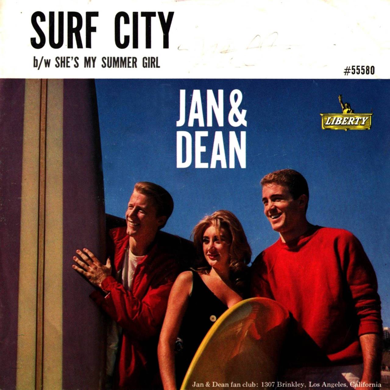
 Success in the record business is like being a world-class surfer. Both require maneuvering into the best possible position. On a board, that spot is the pocket, just in front of the breaking portion of the wave. Too far ahead of the curl and your momentum is lost; too far back and the wave crashes over you in what is often referred to as a wipe out.
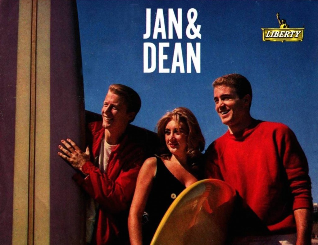
Jan & Dean, the sun-kissed, endless-summer singing duo, were just casual surfers. But as artists they were definite stars who found ‘’the pocket” with their music. “Surf City,” – the first #1 surf song, written by Jan Berry and Brian Wilson – “The Little Old Lady (From Pasadena),” “Ride The Wild Surf” and other singles kept the pair almost continually on the Billboard Hot 100 chart, on which they had two dozen entries between 1959 and 1966.
Along with their pals the Beach Boys, Jan & Dean were the co-architects of the Southern California soundtrack, and helped export the vision of that lifestyle to the other 49 states. They were not only headline performers with The Rolling Stones, James Brown and the others at the legendary 1964 T.A.M.I. Show; Jan & Dean also recorded its theme song and were the hosts of that groundbreaking concert broadcast. The Los Angeles session musicians they recorded with who would later be known as The Wrecking Crew created, under Jan Berry’s production and direction, deceptively complex layered arrangements like “Anaheim, Azusa & Cucamonga.”
But most of all, Jan & Dean and their music was fun. People enjoyed listening.
They could also tackle serious subjects. Their 1964 Top 10 hit “Dead Man’s Curve” (another number on which Berry and Wilson were co-writers) told the tale of a drag race along Sunset Boulevard that ended in tragedy at a particularly sharp and notoriously dangerous turn in the road.
And then the wave broke.
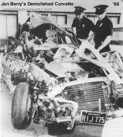
Following an April 12, 1966 appointment with the draft board – very stressful in those ramped-up days of the Vietnam War – Berry was speeding along Sunset Boulevard in his Corvette and made a very, very fast right turn onto Whittier Drive and slammed into the back of a parked truck – just a few short blocks from the Dead Man’s Curve he and Dean had sung about. When his body was pried out of the wreckage, it was unclear if he was dead or alive.
Berry suffered traumatic brain injuries that, after a decade of intensive therapy, still left him with partial paralysis as well as impaired speech and motor skills. It effectively shelved the career of Jan & Dean for the next 12 years. This was a real wipe out.
That left Dean Torrence, 26 years old when the accident happened, at a crossroads. For the first time since kindergarten he had no agenda and no goals to accomplish. His solution was to connect the experience and contacts from his high-profile music career with his University of Southern California degree in advertising design. (During their years as pop stars, both Jan and Dean had remained in college; at the time of his accident, Berry had two years of medical school under his belt.) Torrence opened Kittyhawk Graphics, a company specializing in creative packaging for the music industry.
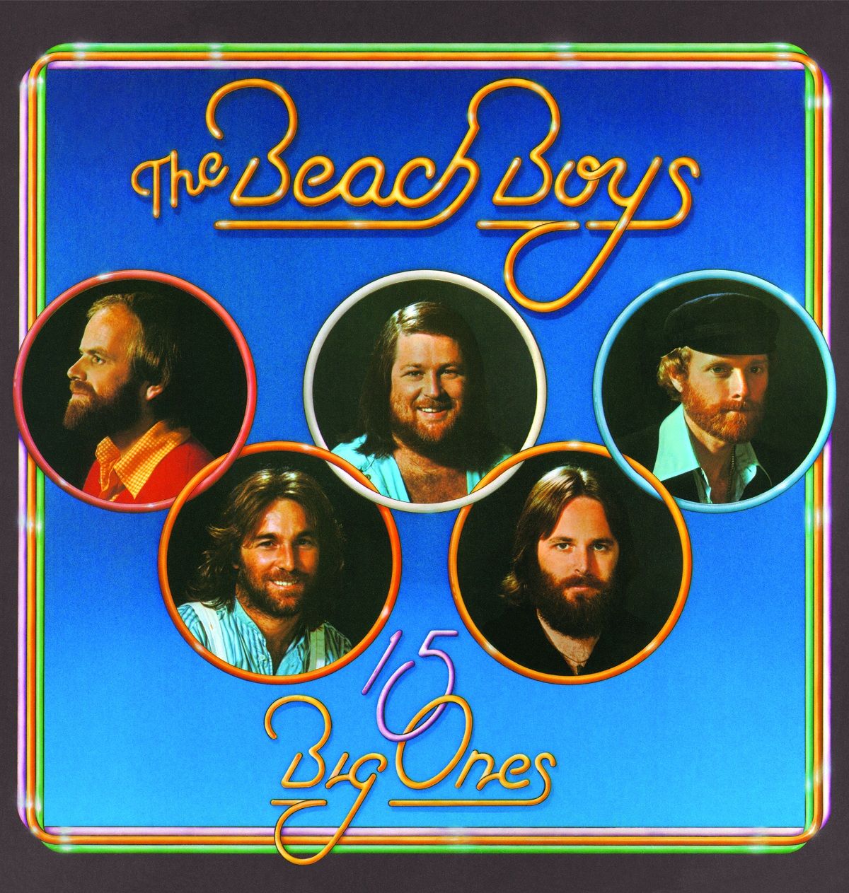
In the tragic circumstance that led to Kittyhawk’s launch there was a lone bright spot: the timing for such a venture could not have been better. The singles-dominated record industry was transitioning to albums. Artists were beginning to assert more control over the nuts-and-bolts details of their careers, like the visuals that appeared on those LP covers. Dean Torrence’s definition of his new role was “to be the artist’s personal graphic designer, to work for them and not the record company.” The formula clicked, and over the next three decades Kittyhawk Graphics created album packages for Harry Nilsson, Diana Ross & The Supremes, Canned Heat, The Ventures, The Beach Boys, The Everly Brothers, Steve Martin, The Temptations, Captain & Tennille and a whole record store full of others. Along the way the company was honored with Best Album Cover Grammy nominations four times, including a 1972 win in that category.
[Torrence’s book Surf City: The Jan & Dean Story can be ordered here.]
♦ ♦ ♦
The St. Regis Monarch Bay Resort in Dana Point, CA, just off the Pacific Coast Highway south of the Los Angeles metropolitan area, is like a five-star grown-up luxury version of the sun and surf lifestyle Jan and Dean sang about in their youth. An outdoor stage was set up on the western edge of a large patio that overlooked pretty much everything cool – the swimming pools, exotic flower gardens, the sun hovering just above the palm trees and over the Pacific Ocean, and also a stunning pale yellow 1951 Ford Country Squire station wagon – aka a “Woody,” as mentioned in the first verse of “Surf City,” so named for its wooden side panels, and the prized vehicle for early 1960s Southern California surfers. The Woody was parked right in the middle of tables of barbecued chicken, tacos, salmon, mini-burgers, fruit, vegetables and drinks. The scene easily could have passed as a movie set for a film that might have been called Surf City 2015.
 Dean Torrence, born March 10, 1940, was the featured singer this evening with The Surf City Allstars: Gary Griffin, Philip Bardowell, David Logeman, Chris Farmer and Aaron Broering, all of whom played at one point of another with The Beach Boys or Jan & Dean. Original Beach Boys David Marks and Al Jardine also sing on occasion with the group, who maintain a busy touring schedule recreating the soundtrack of Southern Cali in the early 1960s.
Related: Review of Surf City: The Jan & Dean Story
As the band took the stage for a warm-up set I was directed to a second-floor room across the patio. Sitting alone at a round table cluttered with the remnants of the band’s pre-show meal was the guy who rhymed “surf route” with “wetsuit,” “rickety old garage” with “Super Stock Dodge.” It was the singer who with Jan Berry imprinted “Drag City” and “New Girl In School” onto vinyl 50 years ago so a few million record players plus transistor and car radios across the nation could blast it all into the American baby boomer’s tapestry. I introduced myself to Dean Torrence, and as I set up my tape recorder was immediately put at ease by his humor and the comfortable disarming charm of someone who has definitely been there. He was happy to talk about the career that not just sustained him after Jan & Dean’s run of hits was cut short but marked Torrence as a distinguished pioneer in quality album package design.
♦ ♦ ♦
Best Classic Bands: When did you first begin thinking seriously about the art on the covers of your records?
Dean Torrence: As an artist I was always frustrated by the (record company) art department, ‘cause I saw everything visually when we were making records about this lifestyle, that ocean and those palm trees out there. As a young person living in Southern Cal we do it often, go to the beach, we’re in the lifestyle and sometimes you don’t realize how cool that really is until you talk to someone from the heartland. And then when we started realizing this is interesting to people in the heartland, that’s when we started doing more of these kind of beach-style records. That was obvious to us musically, then I started thinking, this song explains what it is we’re doing but we need to attach the visuals somehow to the music. Hopefully your product will have some sort of representation of what it is you’re singing about. Kind of link the two together.
BCB: Was that a difficult message to get across?
DT: The late ’50s and early ’60s, a lot of the record company art departments were still staffed by the guys who were used to taking a picture, putting some type up there, and that’s what your cover was. That worked for Doris Day but we weren’t in the era of Doris Day anymore. You’d have that battle, that constant battle, and again the guys in the art department were 15 or 20 years older than us, most of them didn’t particularly like rock’n’roll, they were just tolerating rock’n’roll. They weren’t going to sit around and think conceptually about anything except just how to get these cheesy album covers done and out the door and into the pipeline.
BCB: After you launched Kittyhawk, how did you get around the indifference of record company art departments?
 DT: I found if I aligned myself with the artist, and if the artists, instead of just being pissed off like me, actually got proactive about their album packaging, and brought it to the attention of the person at the top, the record company president isn’t going to give a rat’s ass about the guys in the art department. He’s never really thought about it, those guys just work for him, churnin’ out these things. The president wants to keep his recording artists happy. I’d tell the artists, you gotta take the message to the person that has the most clout in the company, hopefully the president, and tell them, “Look, I’m unhappy with my packaging, I have a message, I need to be branding me, so I am different from anybody else. So the packaging becomes very important, not only my music, but I need the packaging to also tell my story and promote what it is I’m doing.” It all needed continuity.
BCB: What kind of continuity?
DT: You couldn’t have the doofuses in the public relations department writing your bio for you, or picking stuff out of things they were reading or something, or going through their the files and thinking, “Oh I like this picture’, and they’d use it and someone else in another department would use another picture. I wanted it all to have some continuity to it. This is the picture you always use so when a consumer sees it they know exactly who that is, and this is the copy we want, almost like bullet points. This is a business, man. You know the big guys are doing this, the Coca-Colas and the Budweisers of the world already understood it. This is a commodity too.
 BCB: Were the artists on board with your vision?
DT: A lot of times I would have to pull an artist back from trying to go overboard. It’s always nice to push the envelope but there’s a certain place where it won’t be productive, you won’t really get your message across. This is what you have to visualize: here’s your new record being mailed out to radio stations, and they open it up and it’s their first look. Imagine some guy in Minneapolis opening it up, that’s where you start. Will you make it so over-the-top he’ll go, “What is this?”
BCB: You shared office space and worked together with producer James William Guercio. How did that partnership begin?
DT: Jim was the bass player for [British Invasion singing duo] Chad & Jeremy when I met him, but not just a plain old bass player, he’d gone to Juilliard [School of Music in New York City] and was pretty knowledgeable. He was also co-producing the records and worked his way into being their manager. So Jim and I were creating their whole press kit and all their photography, and I had designed a souvenir booklet for them to sell at their concerts. We were kind of putting it together, it was almost like their style guide, I didn’t know what to call it but that’s what we were doing, developing a Chad & Jeremy style guide, and we were going to do all sorts of other stuff. But Jeremy decided he wanted to be an actor instead and quit, so Chad went back to England. I think the first thing that one of us said was something like, “Oh crap, now what do we do?”
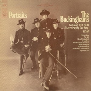
DT: Not too long after Chad & Jeremy split Jim became a staff producer at Columbia Records, then about a week later he came back to the office and said, “I got a group, they’re called The Buckinghams, we’ll just shift all our energy from Chad & Jeremy into these guys.” We came up with them dressing in the civil war outfits for the album cover, both the union and the confederate, one was on one side and one was on the other, then we sepia-toned them and made it look old. Anyway it was pretty clever stuff, and the shots were done in a professional studio and the record company just approved it because we told them that’s what we want. Jim now had some power and he was the producer. I don’t know whether or not the band understood it, but it worked and all of a sudden they were a top-selling group.
[The album, Portraits, was The Buckinghams’ most successful LP and produced two hit singles: “Hey Baby (They’re Playing Our Song),” which reached #12, and “Susan” at #11.]
BCB: What was your next collaboration with Jim?
DT: I was always intrigued by logos for musicians. I said to Jim, do you remember Peter, Paul & Mary, and I went and got my albums. I loved the music but also the way Peter, Paul & Mary used the type font, it was kinda all the same, the continuity there. I didn’t know the word but it was branding. From a distance you recognize the people and the logo on each album. And I said, the next band you find, sign them and we’ll create their logo so we can be part of the process for more than just one album.
So Jim went to Chicago to look for bands to sign. A few days later he called and said, ‘I signed Walt Parazaider’s band, they’re called The Big Thing, but we’re changing the name so you need to start working on the new logo.’ I’m hoping for something fairly simple, Poco or Abba, and he goes (draws out words), ‘Chi-ca-go Tran-sit Au-thor-i-ty.‘ How you gonna make a logo with that, you can’t make a really good logo with 23 letters.
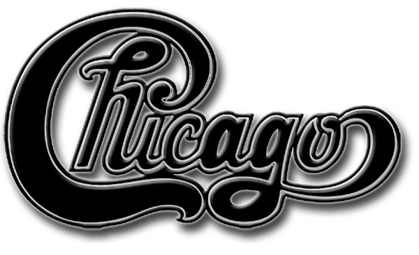 Well, we had both been collecting Coca-Cola stuff and it was all around the office, and there was this big Coca-Cola button right by my desk. So I took tracing paper and went over the C, and all the other letters were variables of the O mostly, I had H’s and I’s out it it. I could do Chicago, it was pretty good. And then T’s, I couldn’t find anything I liked, I went through all my old books and I couldn’t find a good T. Authority was a little easier, Transit was more difficult. When Jim got back I showed him the logo and told him I can see it in my mind, but I can’t get it to work completely the way I want it to here. So he handed it off to a professional hand-letterer in the Columbia Records art department who just knocked it out. The guy absolutely got it, the capital C, the curl of the C that dotted the I, the H inside the C. So the first album comes out, it’s platinum, I’m happy, Jim’s happy, we’re designing more Chicago Transit Authority stuff, and then he comes into the office one day, this is six or eight months later and he says, “I got this idea, I’m gonna shorten the name for the second record and just call the band Chicago.” So no more Chicago Transit Authority.
If you’re a new Best Classic Bands reader, we’d be grateful if you would Like our Facebook page and/or bookmark our Home page.
BCB: The debut album by the band Pollution won the 1972 Grammy for the album cover you created. Where did that idea come from?
DT: The producer of the record was an old friend of mine and had a concept of this chicken coming out of an egg in a gas mask. I told him, well, I don’t think it’s a very good idea but I’m working for you so I’ll try and get it done. I hired a photographer who really wanted to do it, and he said he’d build the gas mask because ya know, this was before Photoshop. So he actually builds a little gas mask and I go over and he’s got a little chicken that he borrowed from someone, and we put the little thing on his head and we let go of him, and he falls over because the mask is too heavy. I never thought of that, so I had to take some pieces of thread and stick it into the top of the mask, and out of frame we’re gonna have to hold this little chick up because he keeps falling over. So that’s how we shot it and then airbrushed out the threads, which you could barely see anyway. So then for the back cover we needed the chicken to lay down, but he’d lay down and he’d keep moving, and I said, no, he’s gotta look like he’s out cold. So someone blew marijuana in his face and we got the shot. And I said we needed to put a disclaimer on here that the chicken was returned in good health.
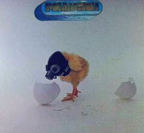 BCB: What didn’t you like about the Pollution cover?
DT: My problem was that it did nothing whatsoever for branding the artist. It’s their first record, and again, imagine the programmer opening up the packaging, and he’s probably going to look at it and think, is this country music, or classical, or is this a kid’s record? They’re completely confused and it does nothing for this poor group that probably busted their butts for the last six months getting it done, and there’s a picture of some stupid chicken on the front and on the back? The next thing we know it gets nominated. ‘See? See?? We told ya.’ Well, the Jefferson Airplane’s Bark album was also nominated, and Sticky Fingers, how are we gonna beat The Rolling Stones? No way. So damn, we won.
BCB: Did the Grammy change things for you?
DT: Because I won, I became the head of the nominating committee for that Grammy category the following year. And at the first meeting with the other graphic designers I held up my cover, and I could see them all thinking, oh he’s gonna tell us all what a great cover it is, I-did-this-and-this-is-how-we-did-this, and I held it up and said, this should never have won. Shouldn’t have been nominated, should never have won. Because this is typical of you guys, you’re all graphic designers. You care about your careers. Yeah, it’s clever, and I wouldn’t mind getting an award if it was for a magazine article. But this is supposed to be branding for the artist and that’s my job. I don’t look at it as an album cover, I look at it as a whole complete package, with the copy, the visuals, the typeface, the dust covers, which we used to include more information about the band. If you want to take my advice, call the category Best Recording Packaging from now on, instead of Best Album Cover. At least they listened to that.
BCB: The year before you won the Grammy, a cover you designed for the Nitty Gritty Dirt Band’s Uncle Charlie & His Dog Teddy album was one of the nominees. What made it special?
DT: We had it printed on matte paper because the tactile feel of it was important. On the dust cover, the paper sleeve that holds the record, it’s a 12-inch-by-12-inch surface and pretty much everyone was leaving it blank, we put a bio on there, and other promotional pieces where you could read about the Nitty Gritty Dirt Band. We used every surface to promote the brand. This was the written word for the band, and you have the music inside for the band, and you have the visuals so you can get an idea of, oh, they’re country guys. We printed it in brown; Dirt Band, dirt is brown, and it has a little bit of texture to it, and it’s not shiny, so when you hold it, it has a really neat feel to it. That’s packaging.
BCB: What’s the story behind the photo on the cover of Uncle Charlie & His Dog Teddy?
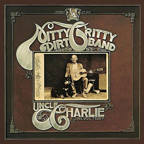 DT: Uncle Charlie was on the front, it was an old black and white photo. So who the hell is Uncle Charlie? He’s an actual uncle of the McEuens (John McEuen played banjo, mandolin, fiddle and steel guitar in the band; brother William was the producer and manager). I took it and copied it, sepia-toned it by hand so it looked really old, and he has a dog sitting right next to him, and he has an acoustic guitar. It’s Uncle Charlie and his dog Teddy. So there’s continuity in it, and it had a back-story, there was a real Uncle Charlie who played guitar and had a dog. And the dog was kind of a metaphor for the dog that was in “Mr. Bojangles” [the oft-covered song by Jerry Jeff Walker that the Dirt Band recorded on the album and enjoyed a Top 10 hit with]. Bojangles’ dog dies, and he still misses him 20 years later, so you see a picture of an old guy with a dog out on a porch and you’re drawn in, the whole thing is like a movie. You’ve got the soundtrack (the album begins with 1:50 audio of the real Uncle Charlie and Teddy), looking at the cover, then listening to the music, it’s painting the whole picture
BCB: You live very close to Huntington Beach, which has been officially known as Surf City for the past decade. Does that ever cross your mind as you navigate Beach Boulevard or Pacific Coast Highway?
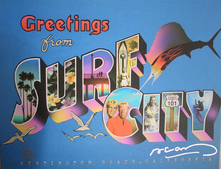
 DT: Yes, it actually does. In fact, a couple days ago I was waiting in line for my service appointment at Surf City Nissan, right under the sign that spelled out Surf City in 8’ tall letters. It’s pretty cool.
BCB: Have you ever told anyone who you are and your connection to the Surf City name?
DT: Naw, they wouldn’t understand. And even if they did, they probably wouldn’t believe me anyway.
♦ ♦ ♦
Although Torrence forged a new career with his design skills, he didn’t stop making music over the years in which Berry underwent intensive therapy to overcome the debilitating effects of his injuries. By 1978 Jan was well enough for the two to start singing on the burgeoning oldies circuit. That same year CBS TV aired a movie about the duo, Deadman’s Curve. Jan & Dean maintained legendary status but never regained momentum as contemporary pop or rock act.
At the conclusion of our interview, Torrence slipped into a Hawaiian shirt and headed out to join the band for the second half of the show. As I slipped my bag over my shoulder and ventured down the stairs to stand at the back of the patio, the sun was dipping below the palm trees and now heading for the ocean, and backlit the band with a soft, pinkish magic-hour glow. The 300 assembled guests – insurance company employees from across the country mostly decked out in I’m-on-vacation! smiles with outfits to match – bobbed, danced, swayed and just flat-out enjoyed the music. As Dean introduced the next song,three guests refilling wine glasses at the table on my right took notice. When the band kicked into it the trio stood shoulder-to-shoulder and joined in for the chorus:
“She’s my, Honolulu Lulu,
Yeah my, Honolulu Lulu,
Queen, of the surfer girls…”
 I wondered where these guys were in 1963 when “Honolulu Lulu” was moving up the chart. Teenagers from the heartland maybe, lured in by this or another one of those beach-style records. They toasted each other at the end of the song, topped off their drinks and laughed all the way back to their table.
Torrence and the band were playing well and having fun in front of a crowd that not only knew the songs, they also knew how to dance and weren’t embarrassed to do so in a public setting. I watched Dean sing the falsetto lead vocal on “Linda” and had a wonderfully obvious revelation: This is the real guy up there, he’s the actual voice on that record. It’s not a Dean Torrance impersonator or cover band; it’s Dean Torrance.
As the applause trailed off following the final song, the members of the Surf City Allstars left the stage and the crowd began to drift away. But Torrence remained up there, chatting with a small group of the guests. A couple was waiting by the stairs to the dressing room, tanned and fit-looking in their tennis clothes, and probably because I looked somewhat official – a clipboard and a shoulder bag will do that sometimes – the woman asked, “Do you think we’ll be able to get a picture with him?” I told them I didn’t see why not, and they exchanged smiles. In the brief minutes we stood there waiting I learned they lived near Virginia Beach and were really enjoying their first trip to Southern California, and of course had a terrific time at the show. “Those songs were all part of the music we grew up with, and it was sure great to hear them.”
When Dean got to the top of the steps there was a smile of recognition and then he gave me a raised-eyes expression I interpreted as something that meant, “How cool was that!?” I asked about the picture, and he answered, “No problem.” The woman handed me her Canon digital and Dean, almost a head taller than both of them, slipped in between. I mentioned how it was their first trip to Surf City, and Dean asked about their hometown, how the convention had been going and when they were heading back to Virginia. He was abidingly polite, the couple were charmed, and I snapped away to capture the souvenirs and conversation piece they were hoping for.
Finally it was just Dean and me. We shook hands and I thanked him for a very cool evening.
“Yeah,” he answered, “It was fun. See ya.”
Jan & Dean’s recordings are available here.

4 Comments
Pingback: The Dean of Surf City - Entertainment Actually
Enjoyed learning more of Jan & Dean and what’s new in their lives. Sure glad we’ve got
their music recorded to hear them over and over….
This was a GREAT STORY! Thank you! Jan and Dean were part of my growing up in the 60’s, right up there with watching the original Endless Summer movie in black and white on tv, “hawaiian shirts”, hot cars and pretty much everyone with a tan around the coast of the Palos Verdes peninsula. Thank you for bringing back so many good memories but more importantly, what happened to Dean Torrence beyond the few lines of what’s been described as an “advertising career” from other interviews.
I’ve still got my vinyl copy of “Gotta Take That One Last Ride”. With the Seagull poster and the accidental ingestion warning. Brilliant design.
And the music is cool, too.