
Creative director John Kosh has designed many essential LPs in your collection
Classic albums naturally start with the cover, and some of the most memorable covers were designed by Kosh. He started off with a bang – the Beatles’ Abbey Road was his first – and went on to provide the wrappings for some of classic rock’s greatest gifts.
Like Let It Be, also for The Beatles. Who’s Next. The Eagles’ Hotel California. You can see them in your mind when mentioned.
Then there’s stuff like the “Ballad of John and Yoko” picture sleeve. Linda Ronstadt’s Prisoner in Disguise. Rod Stewart’s A Night on the Town. You see them again and marvel at their class and taste.
And you recognize immediately logo and illustration-based covers like Humble Pie’s Smokin’, Bad Company’s Run With the Pack, ELO’s A New World Record (including the band’s iconic logo) that capture the spirit of the music within.
And that’s to name but a few of the 2,000 or so LPs he has packaged.
London-born John Kosh was designing for such posh outfits as the Royal Ballet and Royal Opera and was the art director/de facto editor of Art & Artists magazine when he got a phone call from John Lennon, who called up to inquire about running an article on him and Yoko Ono. They met and hit it off, and Kosh 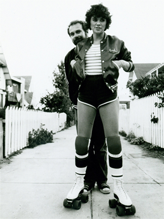 moved over to Apple Records as its art director. In addition to designing covers of albums and singles, he worked with John and Yoko to develop the “War Is Over (If You Want It)” campaign.
A Los Angeles resident since 1973, Kosh has had long-running relationships with a number of artists: Rod Stewart, Jimmy Buffett, Linda Ronstadt (whose covers won him three Grammys). Other artists for whom he did multiple covers include Dan Fogelberg and John Lennon. We asked Kosh to talk about some of his more memorable covers:
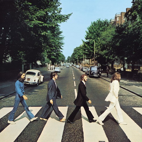 Abbey Road: It was designed without a title and without the name of the band. I received an irate call from the chairman of EMI, Joseph Lockwood, in the middle of the night saying that no one would know what it was. But the next morning George Harrison reassured me: “We’re the fucking Beatles.”
If you’re a new Best Classic Bands reader, we’d be grateful if you would Like our Facebook page and/or bookmark our Home page.
War Is Over: I was going through a minimalist period; I was done with psychedelia. 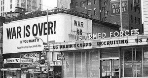 John and Yoko had sent out a Christmas card saying “War Is Over” and wanted to turn it into a worldwide campaign. We put up billboards in 11 cities, banners on the Circle Line Ferry around Manhattan. It turned into something massive. I just found the original negative with my instructions to the printer.
Get Yer Ya-Ya’s Out (Rolling Stones): It was popular in London to eat American food. Mick had an Uncle Sam hat and we put ketchup on top of it, dripping down. But when Altamont happened I was vacationing in Ibiza and came back to find Mick had changed the photo to one of Charlie shot by David Bailey. The back cover and inside sleeve are my designs but not the front cover.
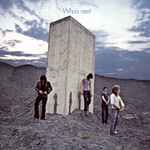 Who’s Next: We took the theme of 2001 and shot the band at pylons for a motorway that was under construction. They peed on the monolith. But Roger’s pee isn’t real – it’s a cup of water we threw at it.
Hotel California: Sometimes artists know exactly what they want and Don Henley wanted a picture of a hotel to personify the song. So we shot three different hotels, blew 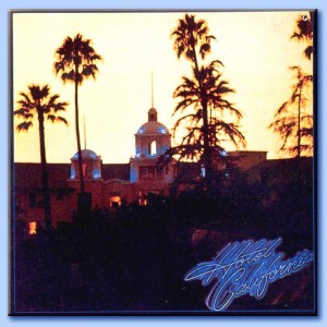 up the photos and presented them. He picked the Beverly Hills Hotel. The logotype is my handwriting made to look like a neon sign. There’s nothing more thrilling than standing in front of the presses as hundreds of thousands of album covers fly out. [Hotel California sold 26 million copies, printed 500,000 at a time.]
Simple Dreams (Linda Ronstadt): Some covers just happen, but this was not one of them. We set up for three days in the ladies room at the Pantages Theatre [in Los 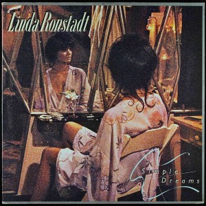 Angeles]. It was so carefully crafted, but then the film stock got discontinued after the first test. I’d learned typography from Sir Peter Newbolt and I employed everything I knew in Simple Dreams. It may not sound humble, but I knew this one would win a Grammy. [It did.]
Related: We spoke to Kosh about his many Ronstadt covers
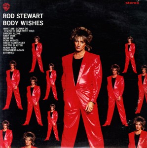 Body Wishes (Rod Stewart): We designed this to take the piss out of the cover of 50,000,000 Elvis Fans Can’t Be Wrong.
Break Like the Wind (Spinal Tap) Spinal Tap have fake English accents and when we initially spoke on the phone about my doing their cover, they thought I was making fun of them. They got really shirty with me until I explained I’m 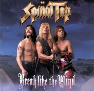 really British. This was when there were still long boxes for CDs and of course Spinal Tap had to have an Extra Long box.
♦ ♦ ♦
“The whole point of my style is there is no style,” Kosh says. “You have to design specifically for – to use an outdated expression – what’s in the grooves. You have to listen to the music and get into what the artist has put down.”
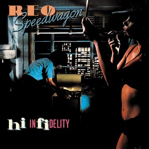 Art directors have to work closely with musical artists and handle the politics of art and commerce. In the case of individual acts, the relationship obviously is one-on-one. But with a band it can be a little more complicated. “You have to gather them together and get them excited, get them to buy in, make it as smooth as possible,” Kosh explains. He adds that typically in a group, one member takes the lead, such as Don Henley of the Eagles and Kevin Cronin of REO Speedwagon.
Unlike photographers or illustrators, who generally retain rights to their work, art directors and graphic designers do not. Kosh was well-paid for his classic covers, but he was paid only once. He receives no royalties. In fact, he says he never even signed a contract for any of his projects.
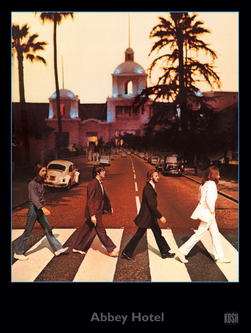 So while Kosh’s images resonate through popular culture, it’s not like they’re generating retirement funds for their creator. He’d probably still be working anyway, because, as he says, “We’re working on things that let us have as much fun as we can.” And, 50 years into his career, Kosh, with his partner Susan Shearer, continues to break new ground.
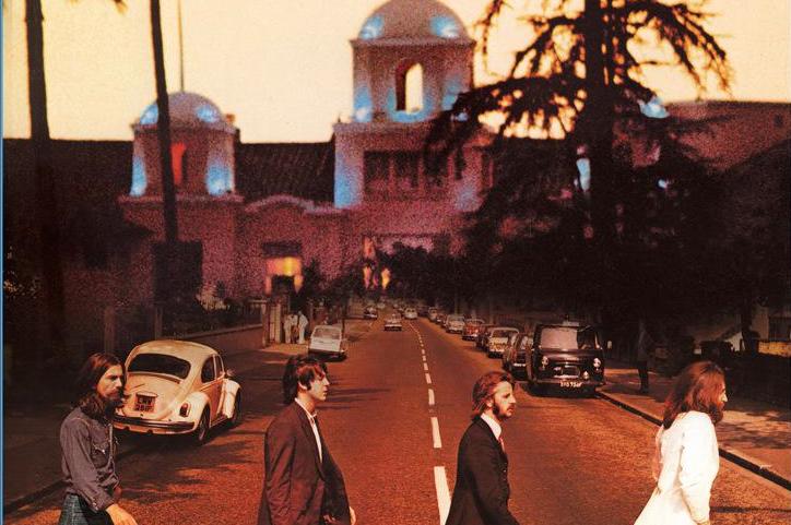
And he has found a way to breathe more fiscal life into his previous creations. Through Kosh Design Studio, he has developed a series of new artwork reimagining his previous works, published in limited editions of 100 each. 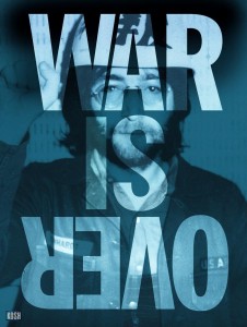 Some are viewable in 3D. Some are mashups, such as that one that shows The Beatles crossing in front of Hotel California or the famous War Is Over logotype over a Kosh-shot photo of Lennon. (They’re available for purchase here.)
Their company Ten Worlds Production works extensively in film, television and multimedia. Projects include opening titles for Turner Classic Movies and art direction and/or production of successful documentaries and series, including Censorship and the Silver Screen. Ten Worlds is currently developing a project based on Kent Hartman’s book The Wrecking Crew: The Inside Story of Rock and Roll’s Best-Kept Secret and a series titled Rock & Revolutions about, among other things, how rock helped bring down the Berlin Wall.
Kosh has one foot planted in the past – he regularly appears at vintage record shows – but he’s firmly situated in the present. His office may be filled with memorabilia, including a cardboard stand-up of Alfred Hitchcock, whose production offices were in this very space. But the work he does today is decidedly modern, even when its subject matter is historic.
[easy_sign_up title=”Sign up for the Best Classic Bands Newsletter”]
- The Beatles at the Hollywood Bowl in 1965: Eyewitnesses - 08/29/2023
- Amy Winehouse’s Death Still Haunts - 07/23/2023
- 12 Influential Early MTV Videos - 04/05/2023

4 Comments
Pingback: Album Cover News Recap for November, 2015 | Album Cover Hall of Fame.com
Pingback: Creative director John Kosh had his hand in many Beatles-related projects | The Fest for Beatles Fans
“We’re the fucking Beatles!”, I love it! George was a man of few words.
That’s a shame that this guy never got royalties. He was the brains behind the artwork. So unfair.